The Client
Pregnancy Center has provided confidential and compassionate assistance to women.
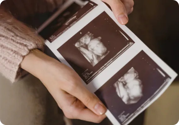
Since 1991, Prestonwood Pregnancy Center has been a trusted source of confidential and compassionate care for women across the Greater Dallas-Fort Worth area. As a nonprofit organization, it thrives on the support of the local community. To modernize their brand, Prestonwood decided to move away from their previous color palette and photography, opting for a refreshed website design featuring vibrant colors and captivating imagery. The primary objective of this revamp was to drive user engagement by creating more opportunities for visitors to schedule appointments, helping the center reach and assist more women in need.
The Challenge
The current website was outdated and was often difficult for users to navigate.
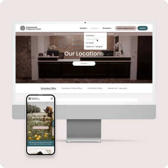
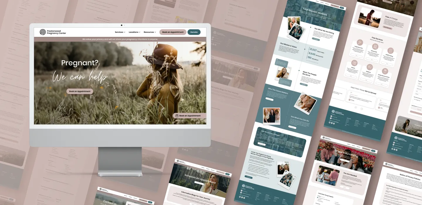
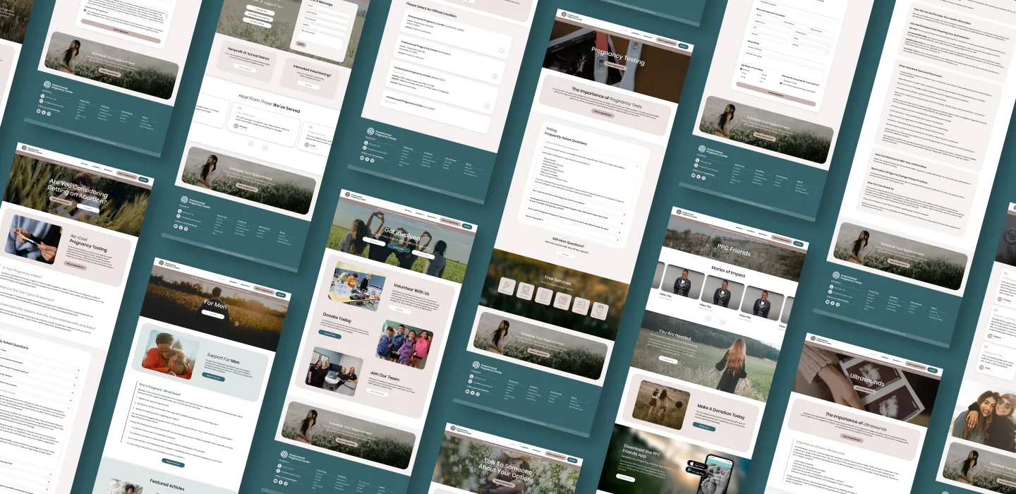
The main challenge in redesigning Prestonwood’s website was developing a streamlined site map to enhance user navigation while incorporating more call-to-actions and opportunities for users to schedule appointments. Additionally, the client requested the new design feature a soft pastel color palette and impactful photography that showcased women in floral environments or engaging meaningfully with one another.

The Solution
Revamping their old website design with new branding and a smoother user experience.
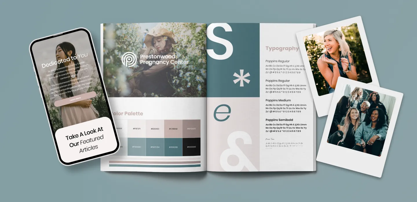
We improved the user experience by reorganizing the page sequence, simplifying content, renaming pages for greater clarity, and streamlining the design to reduce the overall number of pages. These updates were complemented by the introduction of a soft pastel color palette, refreshed typography, and visually appealing photography to create a more cohesive and inviting digital presence.

The Results
The final result was a sleek, modern website with new colors, stunning images, and an improved user experience.
We developed a refined and modern website design that prioritizes a streamlined user experience, making navigation intuitive and providing multiple touchpoints for users to engage with Prestonwood. The site was fully optimized for responsiveness across all devices, ensuring a consistent and seamless viewing experience. Key updates included an enhanced site map and improved user flow, along with a refreshed color palette, typography, and photography. Additionally, we created an updated brand guide to reflect the organization’s renewed visual identity.